前面的博客总结了水平垂直居中和两列布局。
这次我们就继续看一下圣杯布局,也就是三行三列布局。
首先看一下圣杯布局的效果图:
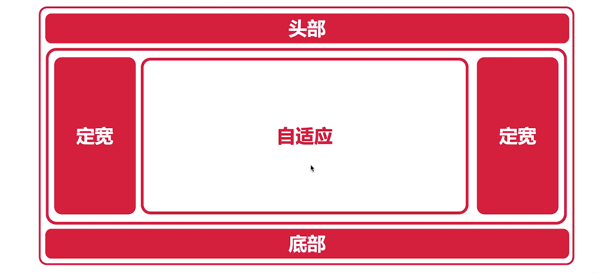
这个布局其实分为两部分,首先是个简单的三行布局,头部,中间和底部。
其次中间部分是个三列布局,而这个三列布局就是圣杯布局的核心。
我们来看一下如何实现这个三列布局。
如何实现三列布局
方案一
看过我前面关于两列布局的博客,大家应该对这个三列布局有点感觉的。
我们先根据两列布局中float + margin的方式改造成三列布局,代码如下:
1
2
3
4
5
6
7
8
9
10
11
12
13
14
15
16
17
18
19
20
21
22
23
24
25
26
27
28
29
30
31
32
33
34
35
| <!DOCTYPE html>
<html lang="en">
<head>
<meta charset="UTF-8">
<meta http-equiv="X-UA-Compatible" content="IE=edge">
<meta name="viewport" content="width=device-width, initial-scale=1.0">
<title>Document</title>
<style>
#left, #right, #center {
height: 300px;
}
#left {
background-color: red;
float: left;
width: 300px;
}
#center {
background-color: green;
margin: 0 300px;
}
#right {
background-color: grey;
float: right;
width: 300px;
}
</style>
</head>
<body>
<div id="parent">
<div id="left"></div>
<div id="center"></div>
<div id="right"></div>
</div>
</body>
</html>
|
大家可以自己试一下这段代码,发现会有点问题,就是right到了下一行。
这是为什么呢?因为float元素不能超过前一个非float元素。
解决方案也很简单,把center移动到最后。
方案二
上面的方案是center放在最后,虽然可以实现效果,但是我们的主要内容一般是放在center中的,所以对于SEO不是很友好,我们可以想办法把center放在最前面。
1
2
3
4
5
6
7
8
9
10
11
12
13
14
15
16
17
18
19
20
21
22
23
24
25
26
27
28
29
30
31
32
33
34
35
36
37
38
39
40
41
42
| <!DOCTYPE html>
<html lang="en">
<head>
<meta charset="UTF-8">
<meta http-equiv="X-UA-Compatible" content="IE=edge">
<meta name="viewport" content="width=device-width, initial-scale=1.0">
<title>Document</title>
<style>
#parent {
height: 300px;
margin-left: 300px;
margin-right: 300px;
}
#left, #right, #center {
height: 300px;
float: left;
}
#left {
background-color: red;
width: 300px;
}
#center {
background-color: green;
width: 100%;
}
#right {
background-color: grey;
width: 300px;
}
</style>
</head>
<body>
<div id="parent">
<div id="center"></div>
<div id="left"></div>
<div id="right"></div>
</div>
</body>
</html>
|
这样的实现其实无法达成效果,因为三者都是浮动的,而center把整个parent占满了,所以left和right会被挤到下一行。
那我们就需要向左移动left,而因为三者是浮动的,所以向左移动可以把left提到上一行。
1
2
3
4
5
6
7
8
9
10
11
12
13
14
15
16
17
18
19
20
21
22
23
24
25
26
27
28
29
30
31
32
33
34
35
36
37
38
39
40
41
42
43
44
45
46
47
| <!DOCTYPE html>
<html lang="en">
<head>
<meta charset="UTF-8">
<meta http-equiv="X-UA-Compatible" content="IE=edge">
<meta name="viewport" content="width=device-width, initial-scale=1.0">
<title>Document</title>
<style>
#parent {
height: 300px;
margin-left: 300px;
margin-right: 300px;
}
#left, #right, #center {
height: 300px;
float: left;
}
#left {
background-color: red;
width: 300px;
margin-left: -100%;
position: relative;
left: -300px;
}
#center {
background-color: green;
width: 100%;
}
#right {
background-color: grey;
width: 300px;
}
</style>
</head>
<body>
<div id="parent">
<div id="center"></div>
<div id="left"></div>
<div id="right"></div>
</div>
</body>
</html>
|